Number 4 I think of the oblique strategy challenge with my mate Matt. This time ‘Ghost Echoes’. Below is a load of self indulgent bollocks I’ve written so if you just want to know about the painting then scroll down about 12 paragraphs (I know and sorry) or just give up and close the window (best choice).
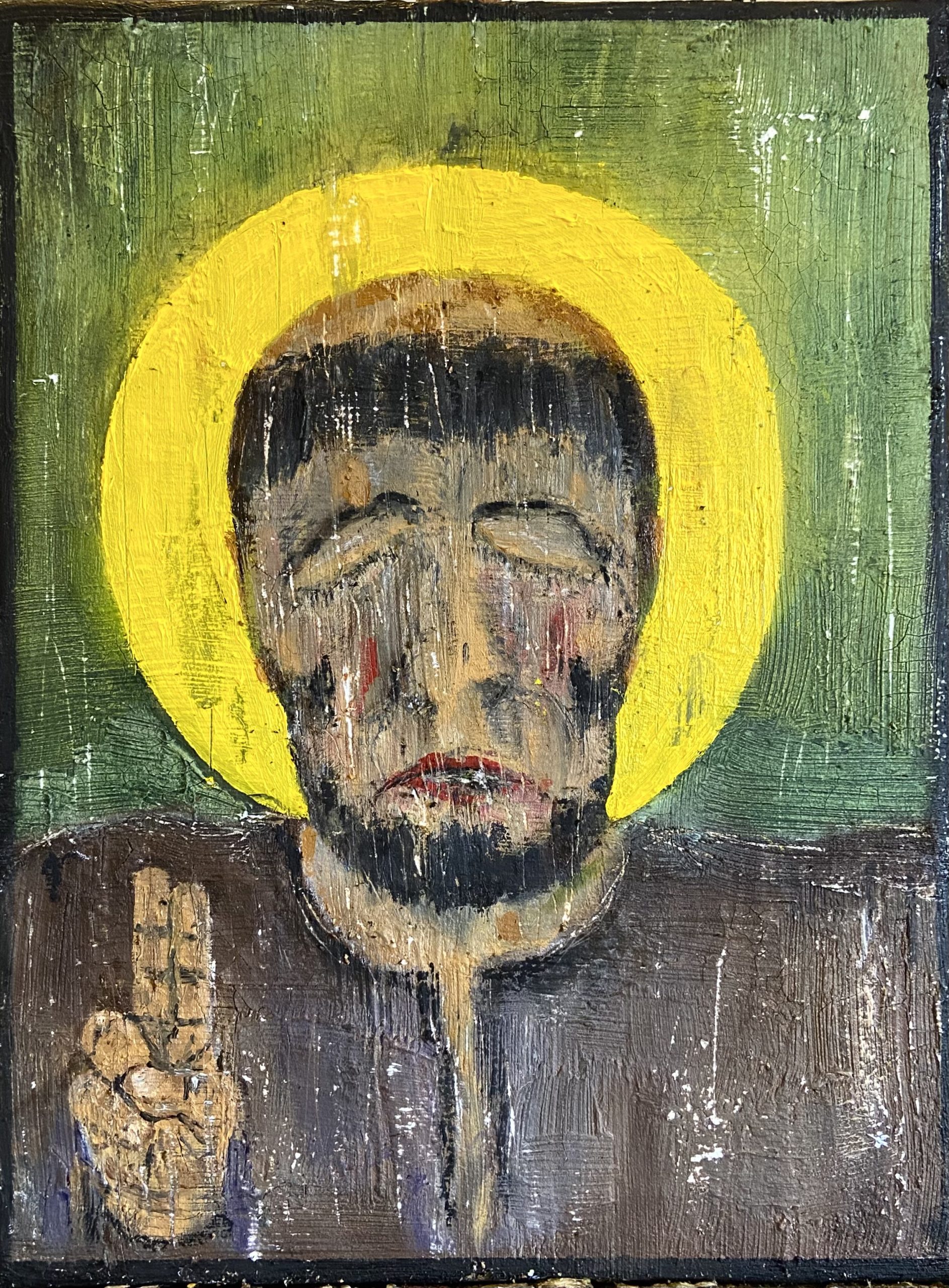
Executive summary: I wanted to try and paint my version of a religious icon and thats what I did. The saint in question is Anthony of Padua the patron saint amongst other things of lost things which seemed very relevant to me.

For as long as I can remember I’ve been fascinated by religion. Its practices, imagery, belief systems and quirks. I was bought up as a Christian, well CofE, the basic sponge cake of religious institutions. Great Norman churches and spooky graveyards but fairly safe. Village fetes, tombolas offering prizes that no one wants and a lot of flower arranging come to mind.
Somewhere in my teens I became an agnostic and then an atheist. But that rejection of my familial belief system did nothing to quell my interest in religion. In fact it fuelled it.
A significant part of that interest has been in the art and architecture found in religious buildings and this I’ve discovered is not uncommon to atheists. Perhaps its a suppressed longing to belong, an envy of those with faith, or perhaps we just like the history and the tranquility that these buildings bring.
It also doesn’t hurt that so much religious art is pure drama. De Vinci, Michelangelo, Reuben’s, so many of the big hitters are represented in this field. My personal favourite is Bosch who went that extra mile, and not just created paintings celebrating the divine but also the damned.
But I’m no expert on art history, and often can’t remember who painted what despite the multiple times I may have seen the image of a famous painting.
Anyway, the religious icon, and I’m just concerned here with those produced to celebrate people or beliefs associated with the christian faith, is a fascinating and sometimes controversial religious art side hustle.
Mainly associated with Eastern Orthodox branches of christianity but also found in Catholicism and Lutheranism. The icon has been around arguably since the days of Pontious Pilate and Luke the Evangelist who have been credited with creating the first ones.
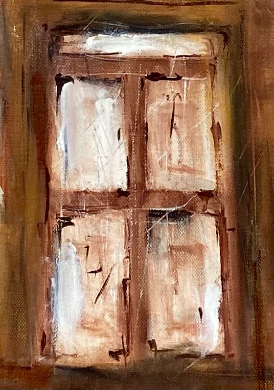
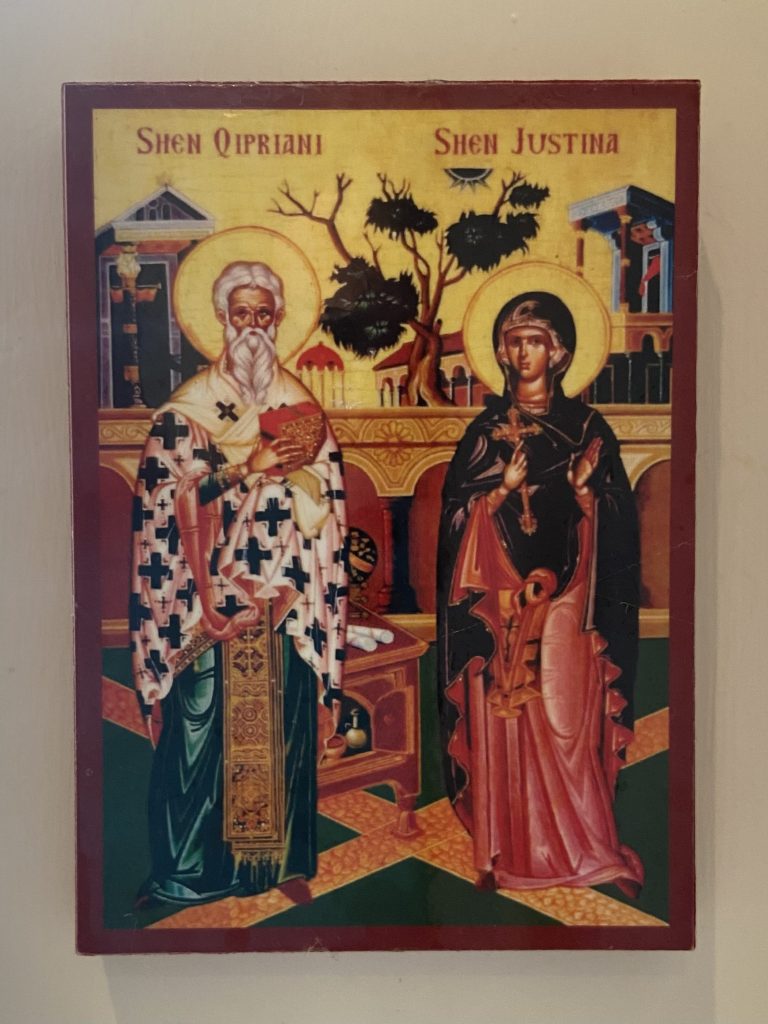
Traditionally painted on wooden board using an egg tempera. They can also be found painted on all sorts of materials. I’ve a couple of metal ones that I bought from a flea market in Kiev many years ago. the one below is a cheap wooden one from Albania.
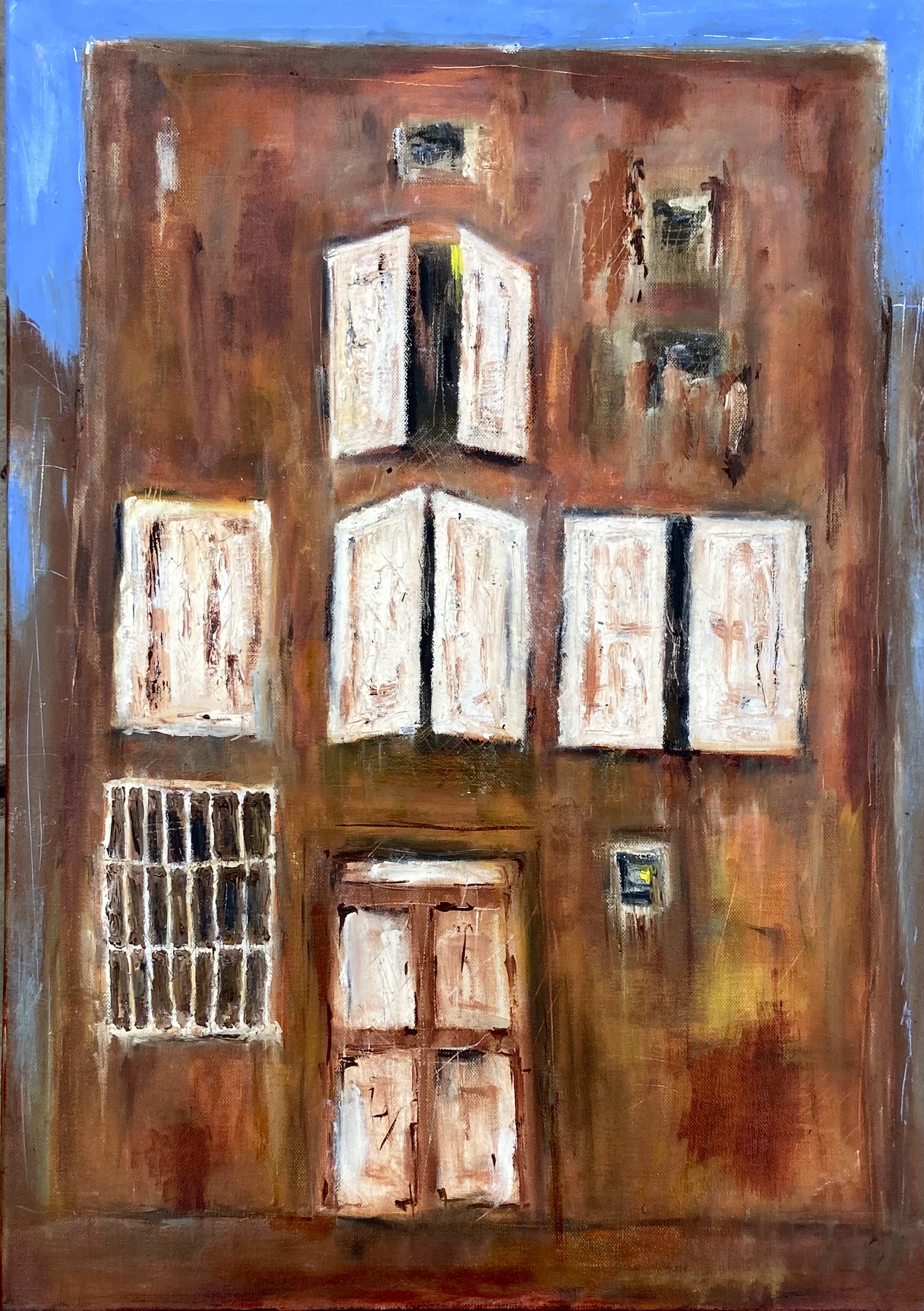
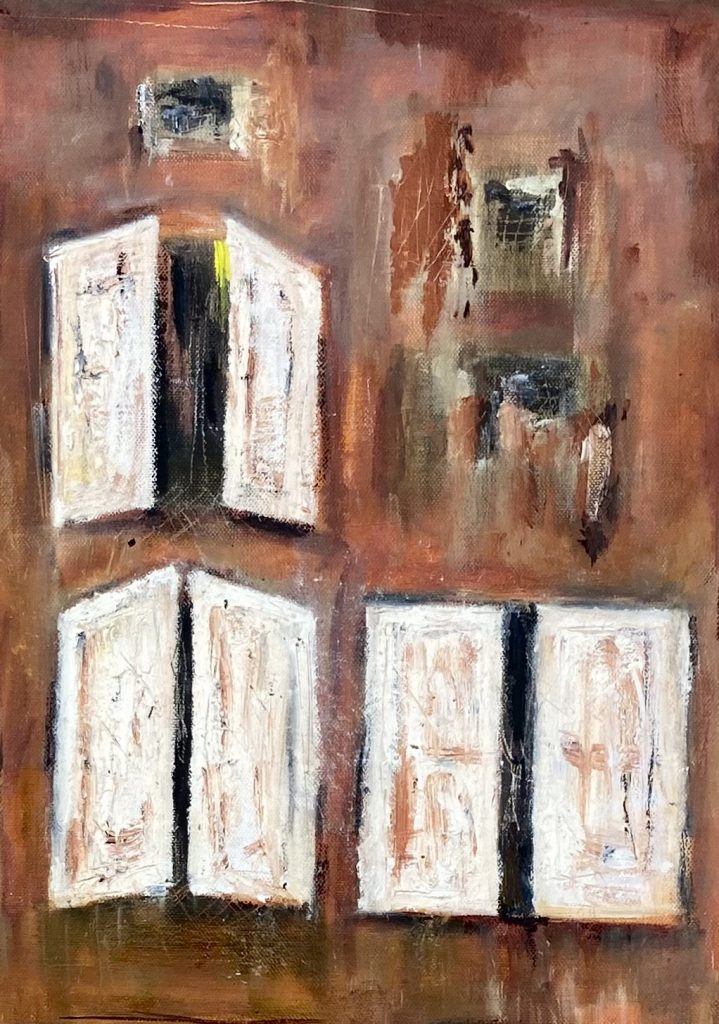
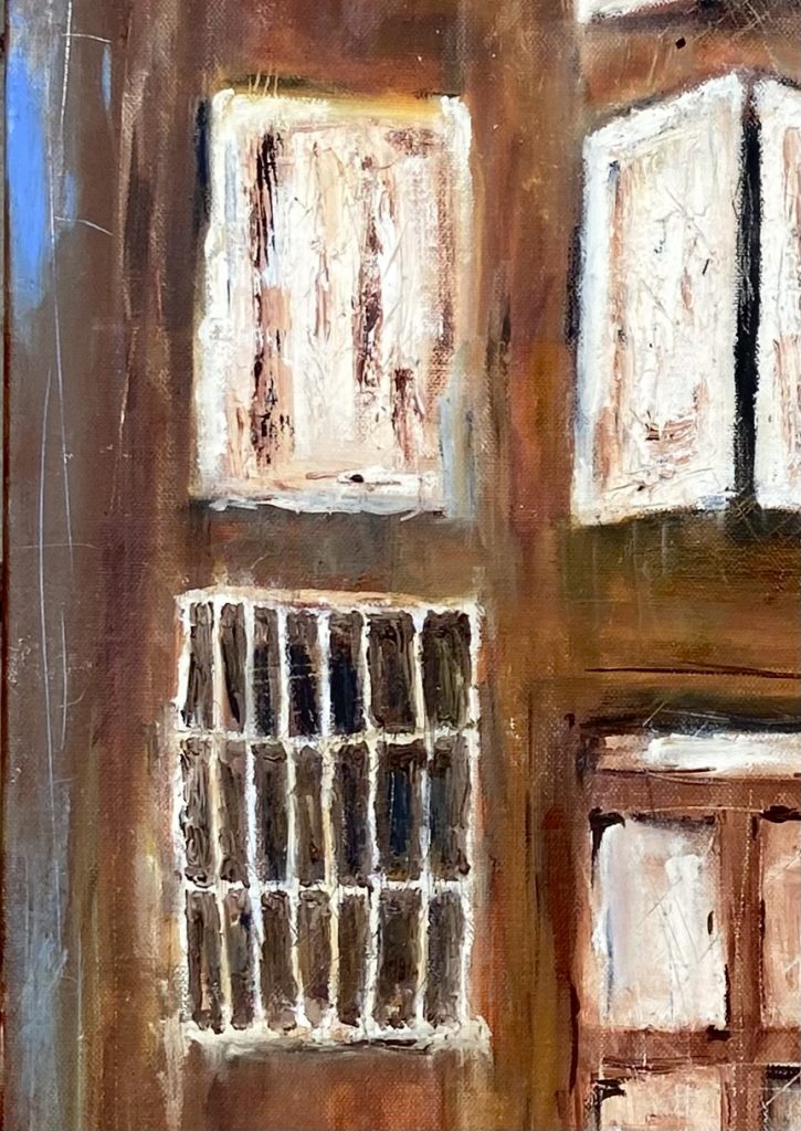
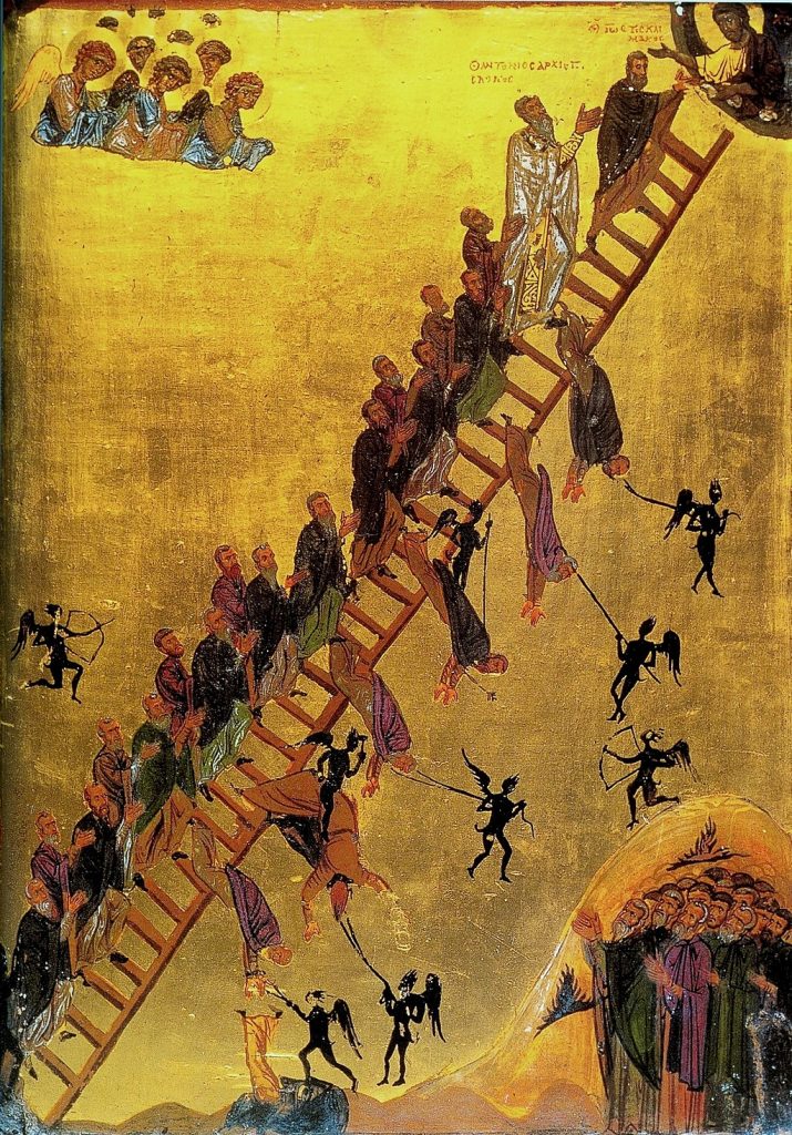
My absolute favourite though is the version below of The Ladder of Divine Ascent which comes from an Eastern Orthodox treatise from 600AD. There are various representations of the ladder which features 30 rungs that the believer has to climb to reach Jesus and therefore heaven. Each rung represents a step that has to be taken and they ascend in what I can only describe as increasing theological complexity beginning with the renunciation of mortal pleasures and ending with something to do with the unity of the supreme trinity (didn’t realise there was more than one). To be honest I was lost at rung 2.
As pieces of art I absolutely love them. I became aware of them first in 1989 when a friend asked us to bring him one back from the Athens flea market we were visiting whilst inter railing.
I don’t know what it is about them, perhaps how authoritarian and one dimensionally fixed the subject is often presented. The colours and the beauty of the older ones and how they’ve decayed. The passion and loyalty to which believers give them etc.
But in reality I like them because of their comedic value. Sorry believers but they do look like something created by another hero of mine, Terry Gilliam.
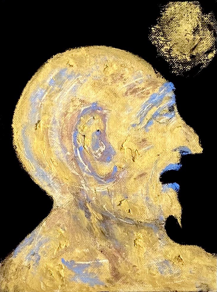
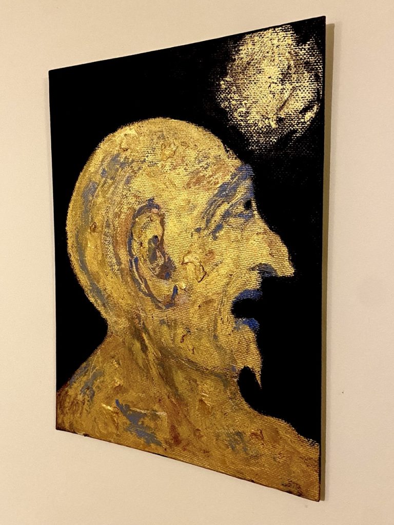
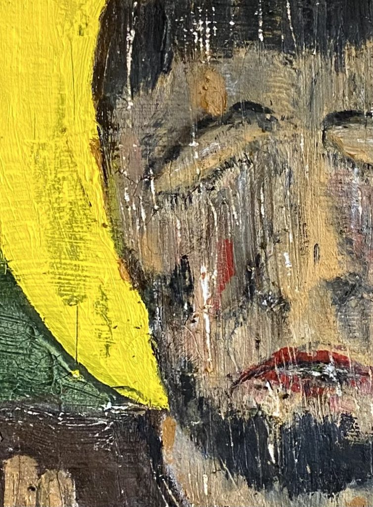
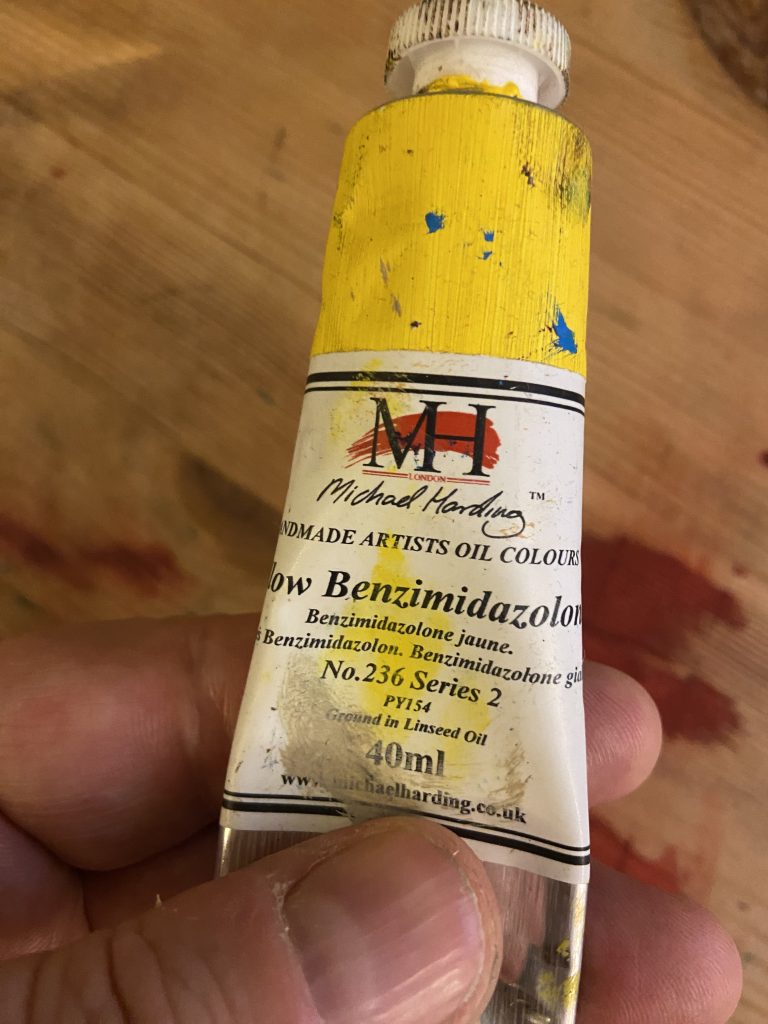
For the painting, I reused a canvas and then coated it with crackle paste which is a tricky substance and doesn’t always crack as it seems to be quite sensitive to thickness and surface. Once dried and partially cracked (and this took a few days). I painted over the top using various Michael Harding and Old Holland oils including a new one called yellow unpronounceable (see picture) which is a tricky blighter to work with as its really low opacity and sort of doesn’t move in anyway you’d like it too either with brush or pallet knife. I was toying with dumping it or buying an expensive medium to try and work with as I really wanted it for the halo. Then I discovered you can use talcum powder and it doesn’t lose its colour. So off to Poundland I went.
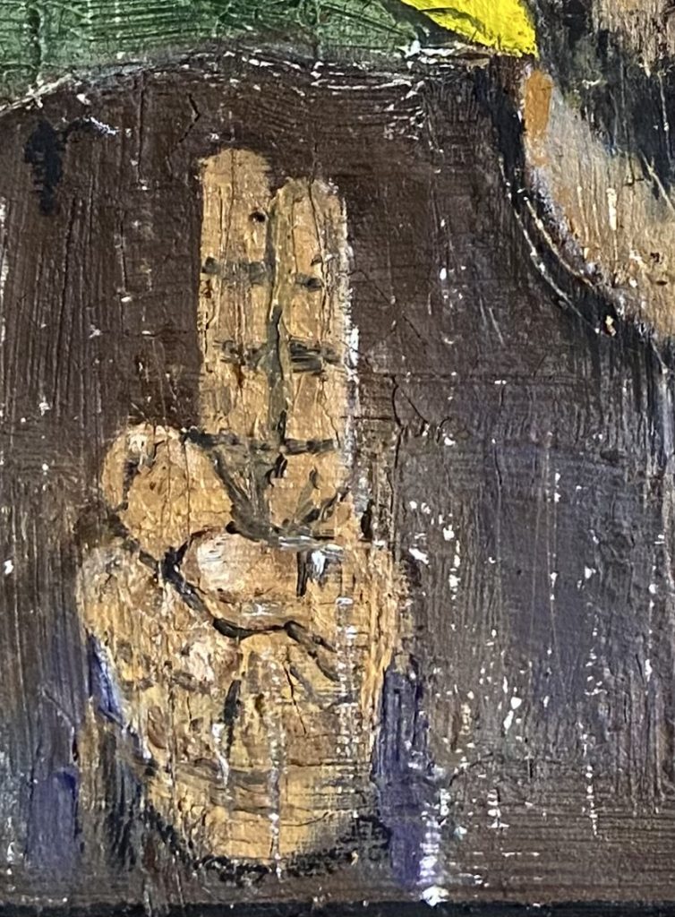
Once I’d painted the picture I took to it with a craft knife as I have a tendency to do, to try and add some age to it. Fairly pleased with my work I set it aside to dry until I realised that I’d painted the fingers the wrong way round because im an idiot (it was the left hand fingers on a right hand if that makes sense). So had to repaint those which fortunately came out looking better than they had. Now its just got to dry and then varnish time to give it that hopefully iconic gloss look.
August 2025